The Process
Stage 1 - The Old
Stage one of the project was to create and present a context capture video which included all the information and other materials that discuss and highlight the existing system with which we've chosen to recreate. See below for that video link.
The video, and the information discovered in the process of making it was the basis with which we as a team used to create our final product and subsequent system.
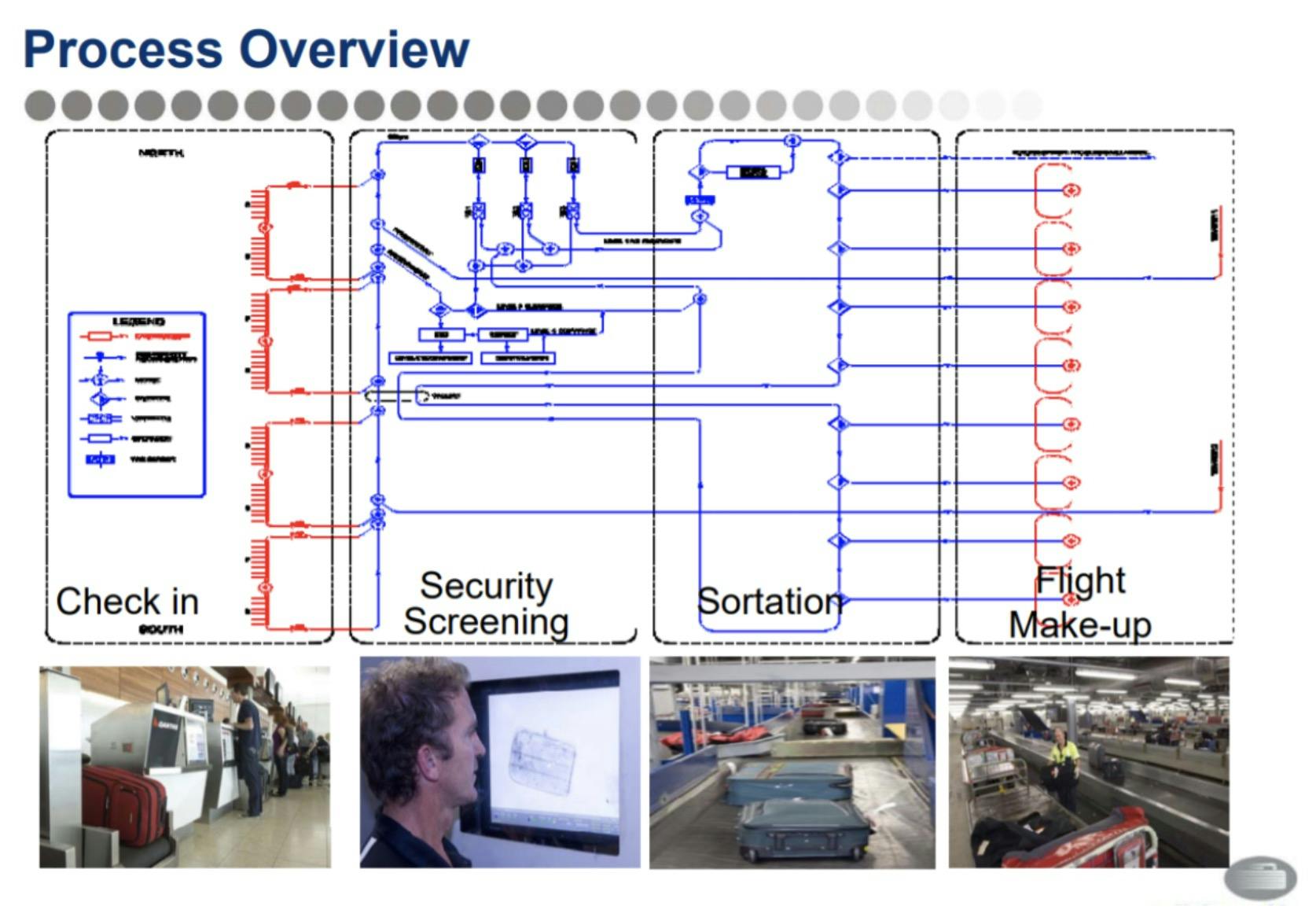
The process here allowed us to collect data by visiting the airport on multiple occasions. By using the use of information collection methods we captured wait times, drop-off frequencies, plane to bag carousel times and so on. This enabled us to find the key friction points within the larger system and identify why and how the slowdowns occur. In conjunction with the airport visit, I also managed to do a few interviews with existing and previous employees of the airport which exposed one glaring flaw that we heavily touched on, which was the lack of communication between systems (one airline would use a completely different system to another, etc).
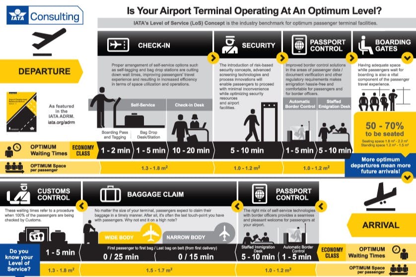
With secondary resources we also managed to find some insightful information with how systems talk to each other (more importantly the lack of communication), the requirements each airport must have and the benchmarks made internationally with regards to time effectiveness.
Some of BNE's maps are pretty bad... What does this even mean?
Stage 2 - The New
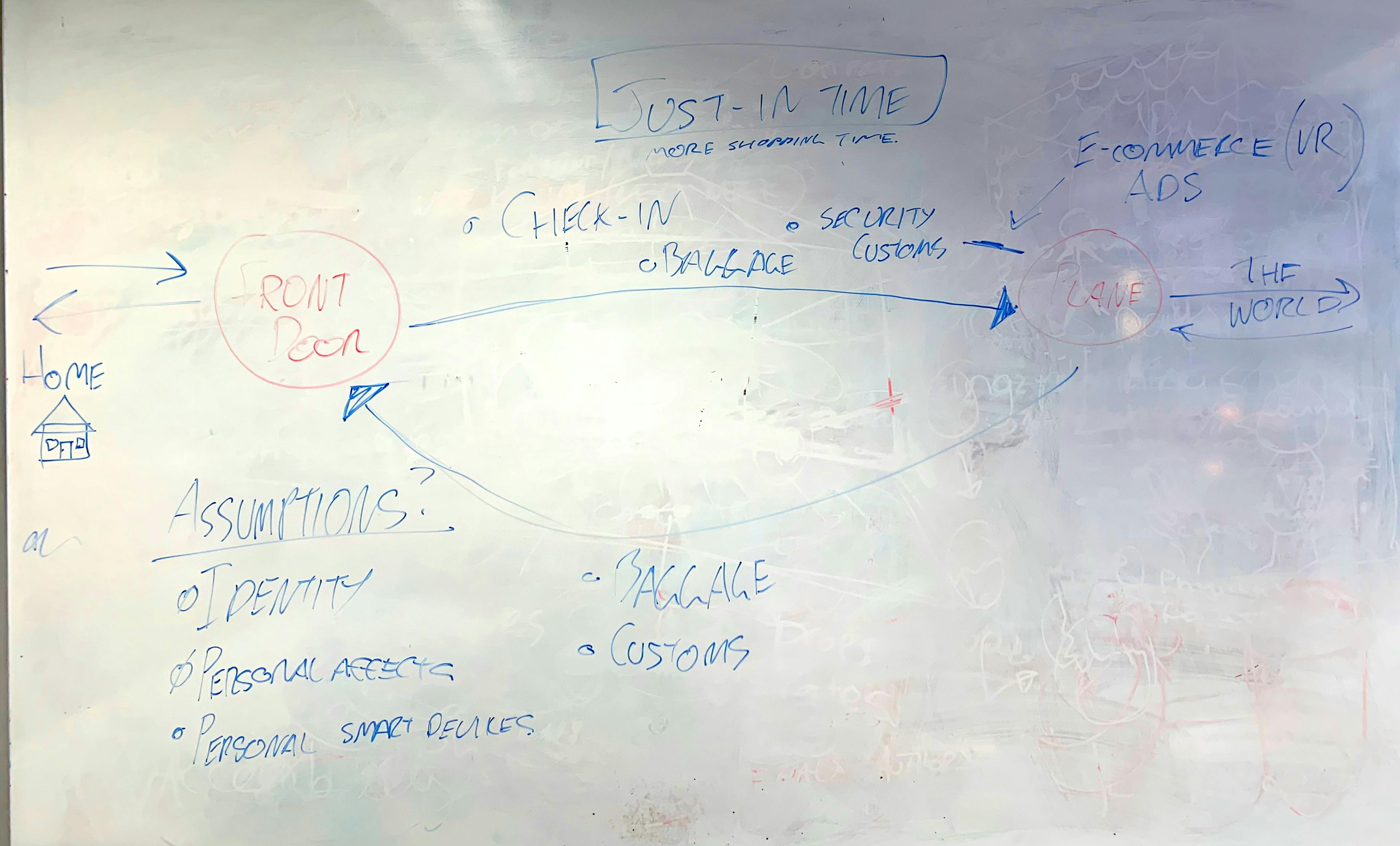
From here we planned out what we wanted, which in this case was to combine all the pre-check systems effectively into one system (with the timeline we had was possible - circa 2050).
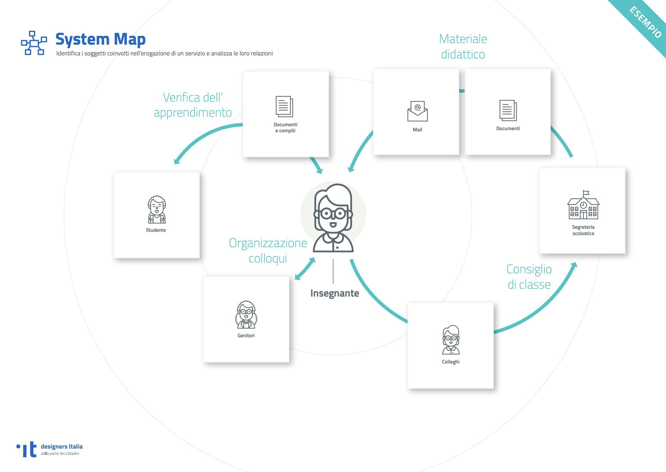
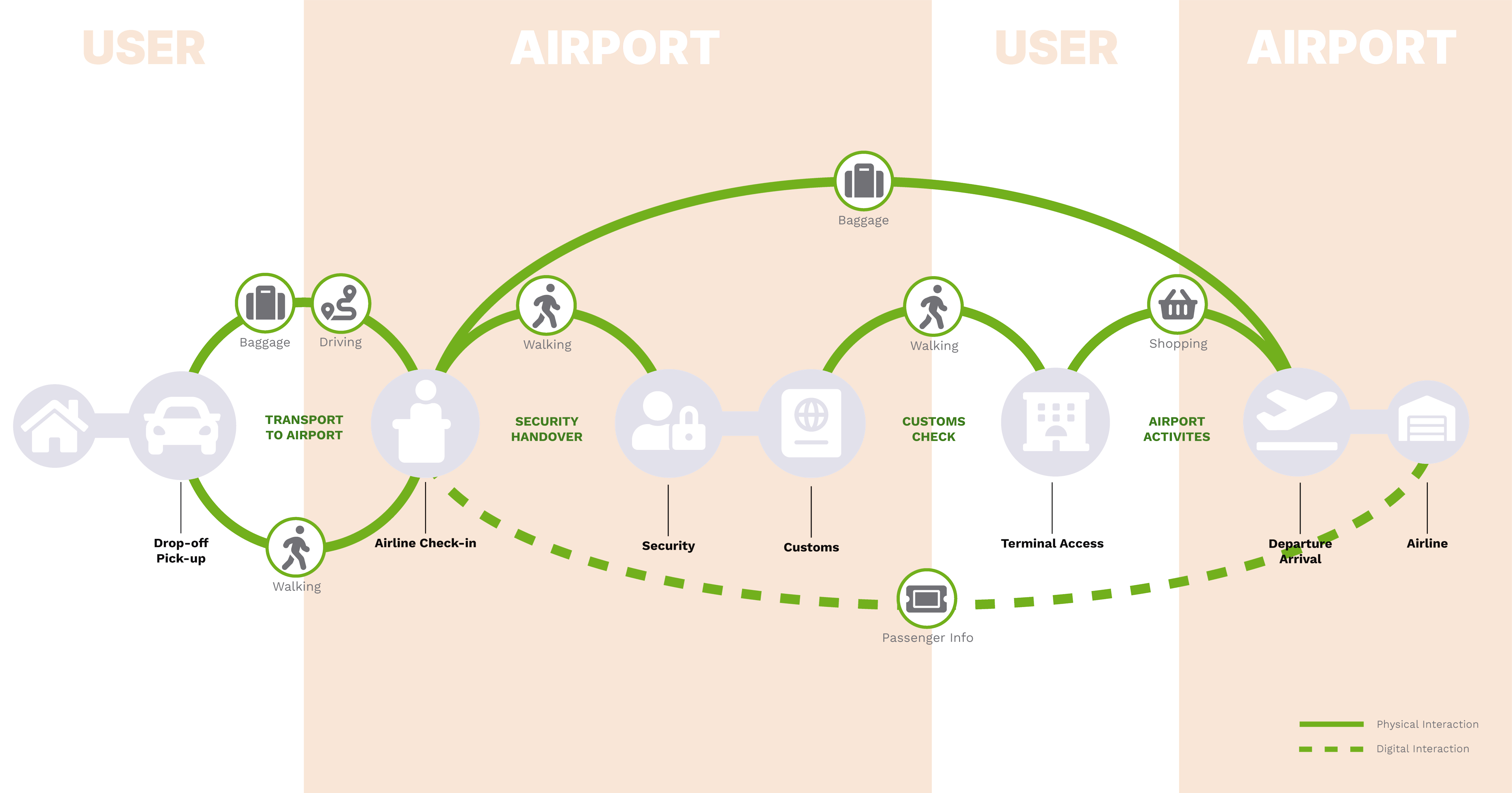
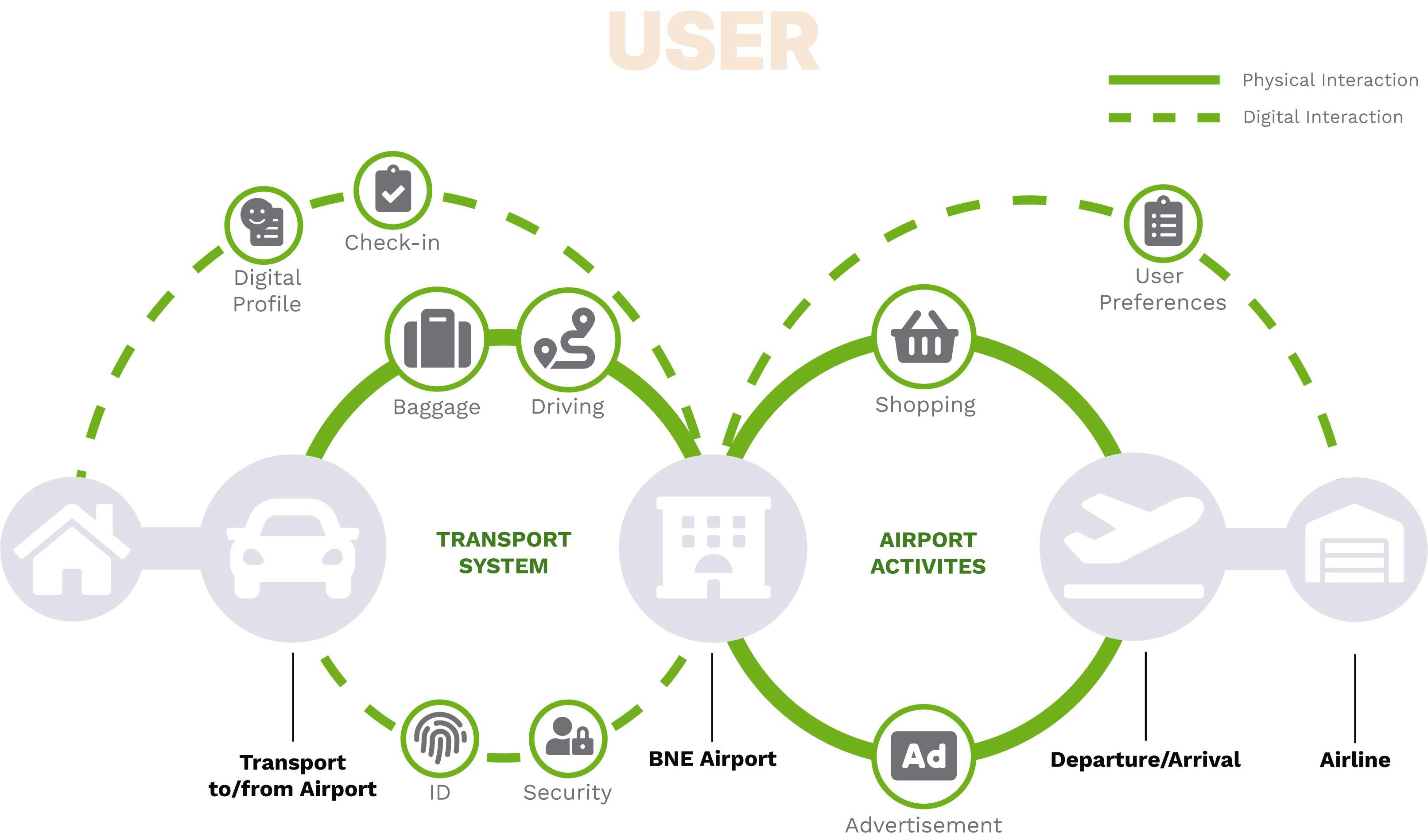
So now what? Did we get it right? Well yeah, nahh - this where I came in because now we had to present it in a way that made sense to everyone at a glance. So here comes more research... Long story short, I kinda got lucky and found Designers Italia which gave a good outline that I thought, would be an effective way to show our old and new system.
Thank goodness for google translate.
From here, it was relatively easy to represent. After some illustrator and font awesome icons later we arrived at our destination (After one attempt which was super lazy on my part.)
The aim of this one was to confuse, but it ended up being too much for that.
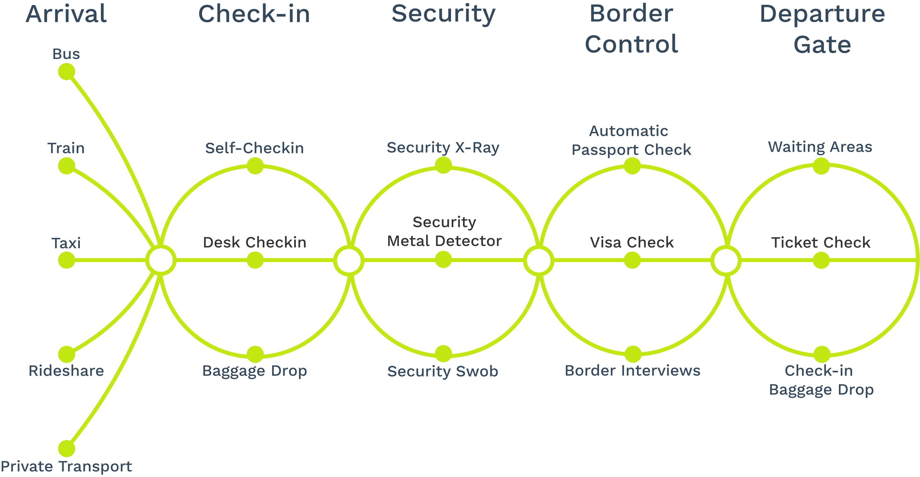
The product
Existing Map
Proposed Map
Looking back at this, I think for the ideas we wanted to get across I achieved in an effective way, but other options weren't tried as much as it should have. Looking forward I'd be keen to try other methods to display large systems such as these.
Links
📁Read the research report